In this article
- What Is Auto Layout?
- Setting Up Auto Layout: The Basics
- Fill vs Hug: The Most Important Concept
- Nesting Auto Layout for Complex Components
- Advanced: Absolute Position Inside Auto Layout
- Auto Layout and Responsive Design
Every professional UI designer who uses Figma considers Auto Layout non-negotiable. It's the feature that makes Figma behave like a real coding environment — where frames resize intelligently when content changes, components adapt to different screen sizes, and spacing stays consistent without manual adjustments. If you're building Figma designs without Auto Layout, you're working ten times harder than you need to be.
What Is Auto Layout?
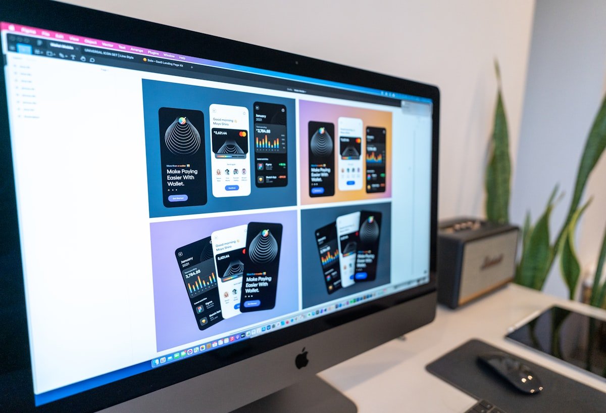
Auto Layout is a Figma feature that makes frames resize and reflow automatically based on their content. Think of it as CSS flexbox inside Figma. You define direction (horizontal or vertical), gap between items, padding around the container, and alignment — and the frame adjusts itself whenever content changes. Add a new list item? The frame grows. Remove a word from a button label? The button shrinks. This is how real code works, and Auto Layout brings that behavior into your design tool.
Setting Up Auto Layout: The Basics
- Select a frame or group and press Shift+A (or right-click > Add Auto Layout)
- Choose direction: Horizontal (row) or Vertical (column)
- Set padding: Space around the content inside the frame (top, right, bottom, left)
- Set gap: Space between items inside the frame
- Set alignment: How children align within the parent (start, center, end, space-between)
Fill vs Hug: The Most Important Concept
Every element inside an Auto Layout frame has two sizing options for each axis: Hug (shrink to fit the content) and Fill (expand to fill the available space). Getting these right is the core skill. A button should Hug its label horizontally so it resizes with the text. A navigation bar item should Fill the available width so the items distribute evenly. Mixing up Hug and Fill is the source of 90% of Auto Layout confusion for beginners.
When a layout isn't behaving as expected, check the Hug vs Fill setting on each child element first. This fixes the problem 80% of the time.
Nesting Auto Layout for Complex Components
The real power of Auto Layout comes from nesting. A card component might have: an outer vertical Auto Layout frame (the card itself), an inner horizontal Auto Layout frame for the author row (avatar + name + date), and a vertical Auto Layout frame for the text content. Each layer controls its own spacing. When you add a new line of text, the card grows automatically. This mirrors how a developer would build the same component in CSS.
Advanced: Absolute Position Inside Auto Layout
Sometimes you need an element to break out of the Auto Layout flow — a notification badge on an icon, a close button overlaid on a modal header. Figma lets you set individual elements to 'Absolute Position' within an Auto Layout frame. They become positioned relative to the parent frame but don't affect the flow of other elements. This is the CSS equivalent of position: absolute inside a flex container.
Auto Layout and Responsive Design
Auto Layout is the foundation of responsive design in Figma. By setting frames to Fill on the horizontal axis and nesting appropriately, you can create layouts that adapt to different viewport widths. Combined with Figma's constraints, you can design a component once and have it behave correctly across mobile, tablet, and desktop frames with minimal adjustment.
Auto Layout is one of the core skills taught in Aizenmarq's Figma curriculum — students build real product components with proper Auto Layout structure from day one. Visit aizenmarq.com to learn more about the training program.