In this article
- The Color Wheel and Basic Relationships
- Building a UI Color Palette
- The 60-30-10 Rule
- Contrast and Accessibility
- Color Psychology in UI
- Dark Mode Considerations
Color does more work in UI design than most beginners realize. It communicates hierarchy, guides attention, establishes brand personality, creates emotional tone, and signals interactive states. Used well, color is invisible — it just feels right. Used poorly, it creates confusion, fatigue, and distrust. This guide covers the essentials.

The Color Wheel and Basic Relationships
Start with the fundamentals: hue (the color itself), saturation (intensity), and lightness (brightness). On the color wheel, colors relate to each other in predictable ways. Complementary colors (opposite on the wheel) create contrast. Analogous colors (adjacent) create harmony. Triadic combinations create vibrant, balanced palettes. Understanding these relationships gives you control over how your UI feels.
Building a UI Color Palette
- Primary color: Your brand color — used for primary actions, key UI elements, and brand identity
- Secondary color: Complements the primary — used for accents, secondary actions, highlights
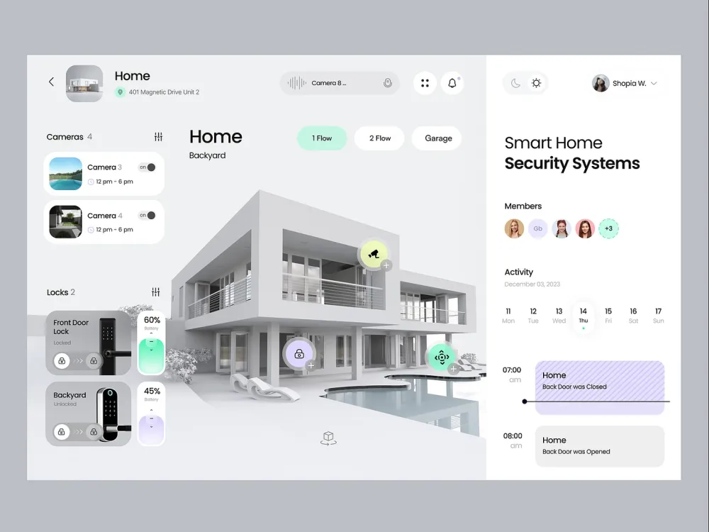
- Neutral palette: Grays from near-white to near-black — used for text, backgrounds, borders, and dividers
- Semantic colors: Red for errors, yellow for warnings, green for success, blue for information
- Surface colors: Background layers, card backgrounds, sidebar fills
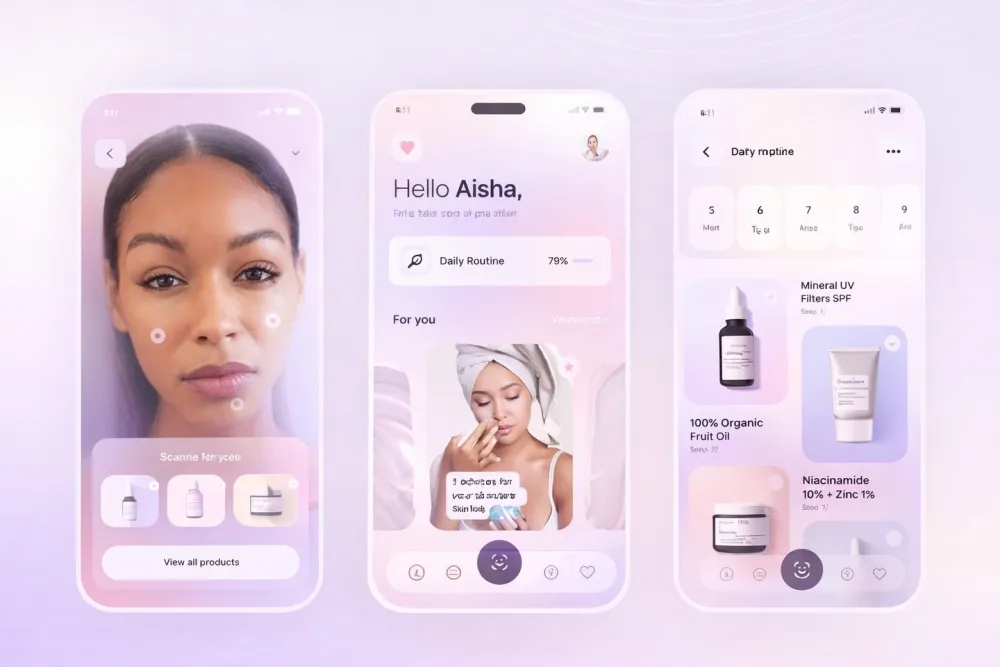
Generate your neutral palette by slightly tinting your grays with your primary color's hue. This creates a palette that feels cohesive rather than sterile — a technique used in every major design system from Google to Apple.
The 60-30-10 Rule
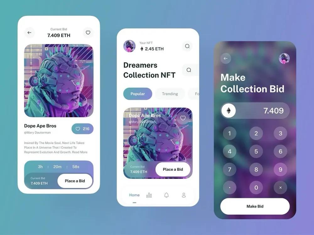
A practical rule for balanced color composition: 60% of your UI should use your dominant color (usually a neutral background), 30% should use your secondary color (structural elements, sidebars), and 10% should use your accent/primary color (calls to action, highlights, key interactive elements). This ratio prevents visual noise and ensures clear hierarchy.
Contrast and Accessibility
WCAG 2.1 requires a contrast ratio of at least 4.5:1 for normal text and 3:1 for large text against its background. This is not optional — it's a legal requirement in many countries and a basic standard of professional design. Use tools like Stark or Contrast Checker in Figma to verify every text/background combination in your design.
Color Psychology in UI
- Blue: Trust, reliability, calm — dominant in fintech, healthcare, productivity tools
- Green: Growth, success, nature — popular in finance apps and wellness products
- Red: Urgency, danger, passion — use sparingly; reserve for errors and critical alerts
- Orange: Energy, creativity, warmth — great for CTAs and brands targeting younger users
- Purple: Premium, creativity, wisdom — popular in luxury and creative tools
- Yellow: Attention, optimism — effective for warnings and highlight states
Dark Mode Considerations
Dark mode is not inverted light mode. Backgrounds in dark mode should not be pure black (#000000) — use dark grays (#121212 to #1E1E1E). Surfaces at different elevations should use slightly lighter shades to create depth. Your brand colors typically need to be desaturated slightly for dark backgrounds to prevent them from feeling aggressive.
Color theory is one of the core fundamentals taught in Aizenmarq's UI/UX design training in Hyderabad. Students learn to build complete, professional color systems from scratch. Visit aizenmarq.com to learn more.